Tuesday, 20 January 2015

Contents page layout choice

My Designs 


As you can see my 4 designs are specific to my layout research. I have incorporated the larger numbers and the shapes in the page. I have made sure the column is on the left side only taking up roughly 2/3 of the page. All of my writing is sans serif, this is also in bold to draw attention to the title. I have included a competition or image in each design to break up the page.

My final design and why


Monday, 19 January 2015

Contents page font research

Font Research

Primary Research-Existing Magazines

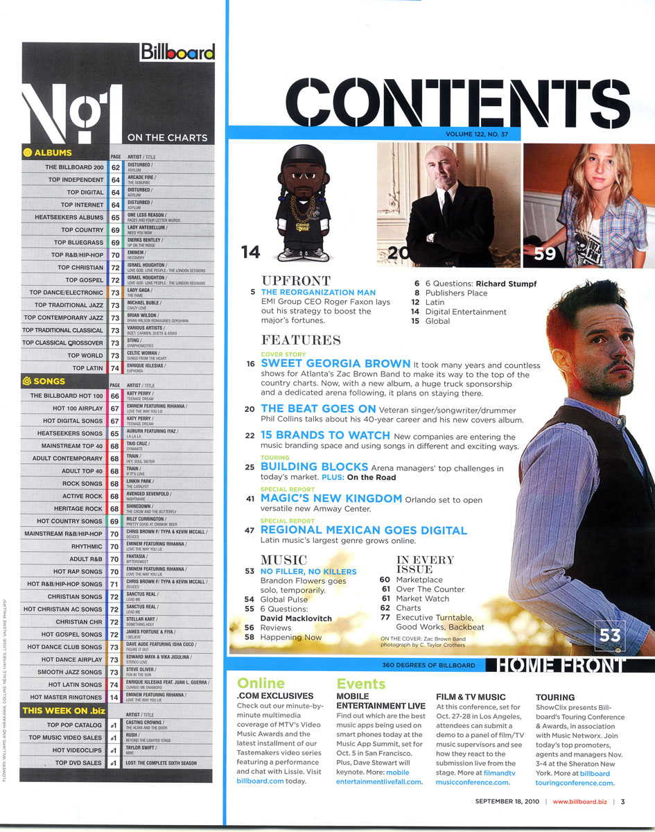
As you can see, the majority of the 'contents' page words are sans serif. This is something that I am going to put into my own magazine. It makes the wording more bold and comes across as a powerful statement, one that needs to be read. As well as this they are all bold colours, this is something I am going to use. It will like in with my house style. Within the words 'contents' it also has the name of the magazine, this is also something that I am going to incorporate.

Original Headers

As you can see, from my earlier research all of the fonts were sans serif, as well as this they were also quite large and bold. When choosing my fonts this is what I focussed heavily on. I chose 18 different fonts, some are similar to each other. With these fonts I then asked my target market which one they most likely thought they would see on this genre of magazine. They chose a variety and I narrowed them down, I did this but looking at which font is most similar to the research that I have done. This font was ______________________

More Developed Fonts

I then took this font further. I decided to play around with the colour, I chose to only incorporate colours that are in my house style, this is to create continuity throughout the magazine. I did put some of the titles in lower case, however as my research did not support this it was not one of my favourite ideas. I also played around with the effects on the font. I liked the 'inner bevel' effect, this is because it is the same thing that my title has and I feel making them similar looking will look good, as well as this it makes the header stand out more.

Questionnaire 

As you can see I devised a tally chart and asked my target market which heading they thought looked the best. As you can see it was number 8 that got the most votes. This is also the one that I chose. I felt that if it was all pink it would be over powering as I have planned to also have pink within my contents page layout. As well as this the 'inner bevel' effect works well to make it come out of the page.


Contents page layout research

Common things found in all of the magazines I have researched


In all of the magazines I have researched I have found that the way the contents of the magazine is displayed is in a strip. This is something that I am going to use in my magazine as my consumer will be able to easily see what is going to be in my magazine in list form. As well as this they are situated on the left side of the page. This is something I am also going to be able to input into my magazine. All of the columns only take up roughly 2/3 of the page, this is to make room for the larger images on the page.
These features in the magazine make it desirable for the consumers. It takes up a small place on the page, yet will attract my target market, this is something that i am going to use in my magazine. I will apply it to my target market. Bold lettering has been used to make it stand out and also an image to draw attention to it.


Many of the magazines have used larger numbers as different features in the page. This is clever because it draws attention to that specific page and also changes the dynamics of the page as it breaks the page up. The circled numbers on the page especially create a friendly fun feel to the magazine. 

Many of the magazines have the issue date on the contents page, this is something I am going to consider however I have put it on the front cover so it is not necessary to put it on the contents page. All of them are small and in the corner of the page. The writing links in with the house style of my magazine.


Contents page photo research

Photo Research 

As you can see the majority of the photos for each contents page are one large focus picture and then smaller pictures for different features. This is something that i want to put into my magazine contents page. I feel that the big photo that I am going to use is going to be a different model on the front. This is because I feel that my model for the front cover has very strong facial features and for my double page spread i want someone with a better suited body to my contents page research. The photo that i am going to create will have to link to the theme like these photos. Therefore i am going to have my model in headphones so the genre of music is easily identified.

For my photo I want to use a long shot like this, i feel that it will get all of my models body in which is something I want. In that contents page the models facial expressions look very connected to the type of musician he is. The props that have been used are very simple, just a chair a guitar and a microphone. This is was represents him and portrays what sort of character he is. Therefore i want to create a more seductive look for my model, this is because DJ/Dance/House music is often related to Ibiza and other club places, in Ibiza bikinis and other skimpy clothing tends to be worn, therefore if this is how I dress my model it will instantly become clearer which genre I have done. 

Photos I want to use

As you can see the photos that i have researched into all of the models are in revealing clothing. This is something that I am going to tone down, however I like the photos with the headphones in. 
This picture is the guideline that i want to use when taking my pictures for my contents page. However i feel this positioning too seductive, therefore I am going to make my model stand up against a wall like this with one foot on the ground. I want my model to wear heels and also wear headphones. 


This position will fill up most of the contents page as it is a larger picture. I am going to use a long shot for this image to make sure I get all of the model in.